Republic Records
Role:
Product Design
Brand Design
Overview:
Redesigning Republic Records’ website to emphasize artists and new releases through a modern, photography-driven interface.
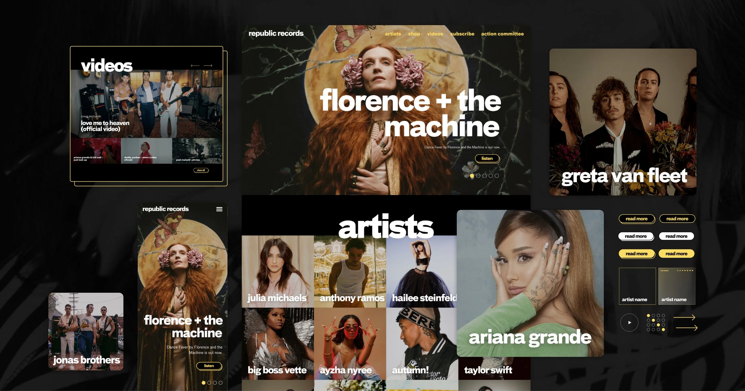
PROBLEM
The previous site relied on a text-heavy list of artists with hover interactions that revealed images. This experience felt dated and made browsing the label’s roster difficult and visually unengaging.
Design Approach
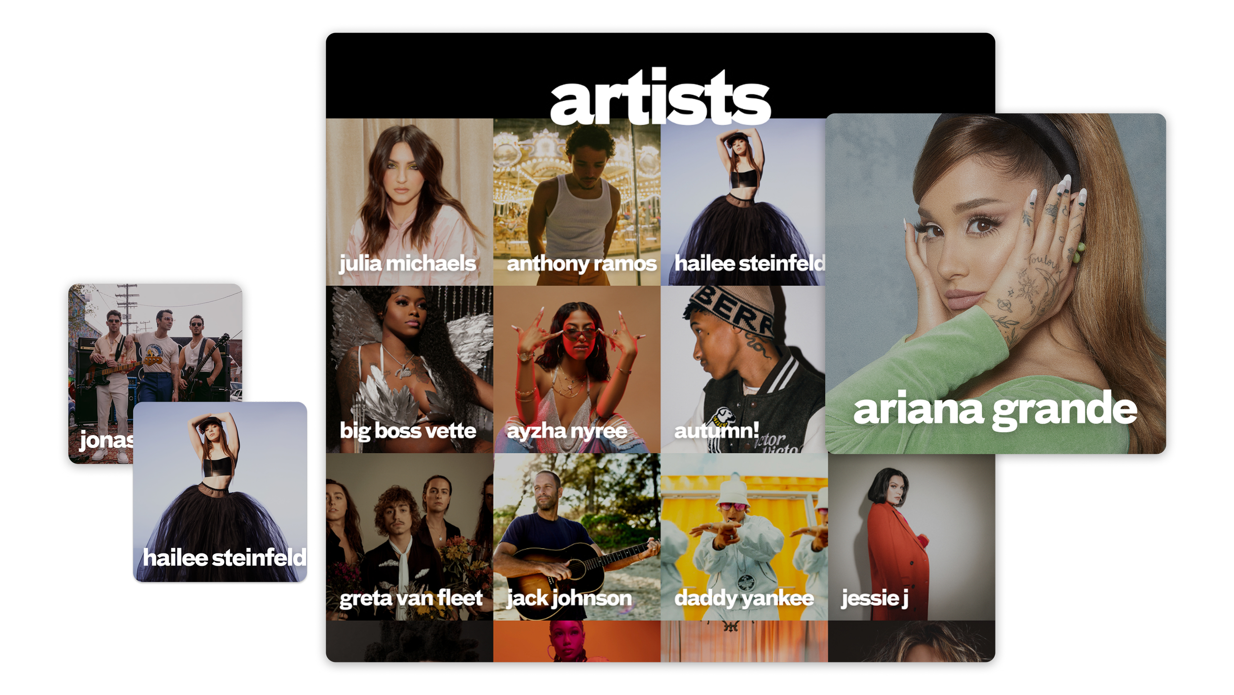
Since the artists themselves are globally recognized, the design centered around large, high-quality photography. A responsive grid layout replaced the previous list structure, allowing visitors to explore the label’s roster visually.
Artist-First Interface
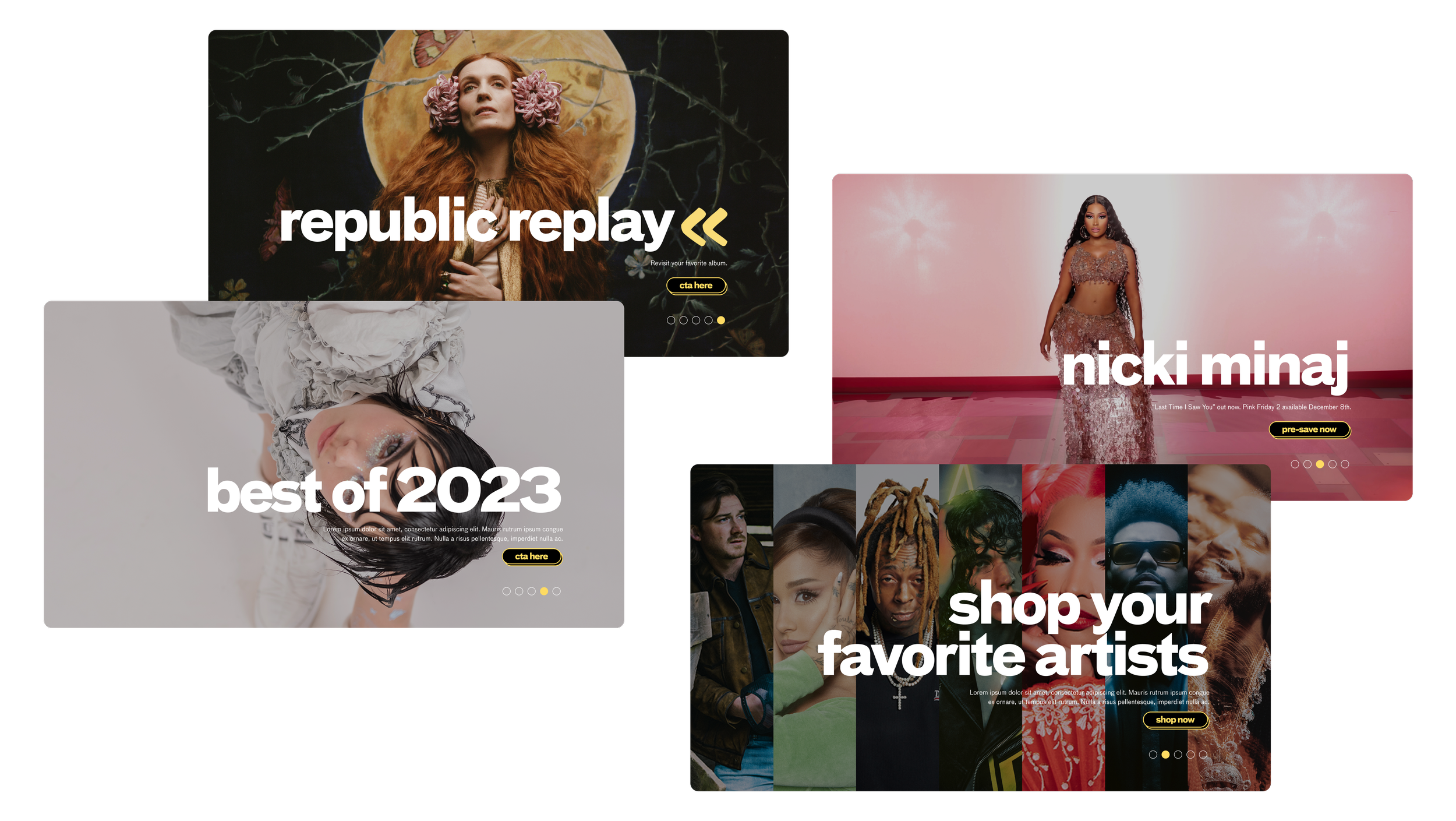
The homepage highlights the latest music releases through a rotating hero carousel, while the artist grid provides direct access to each artist’s website and social platforms.
Simplified Navigation
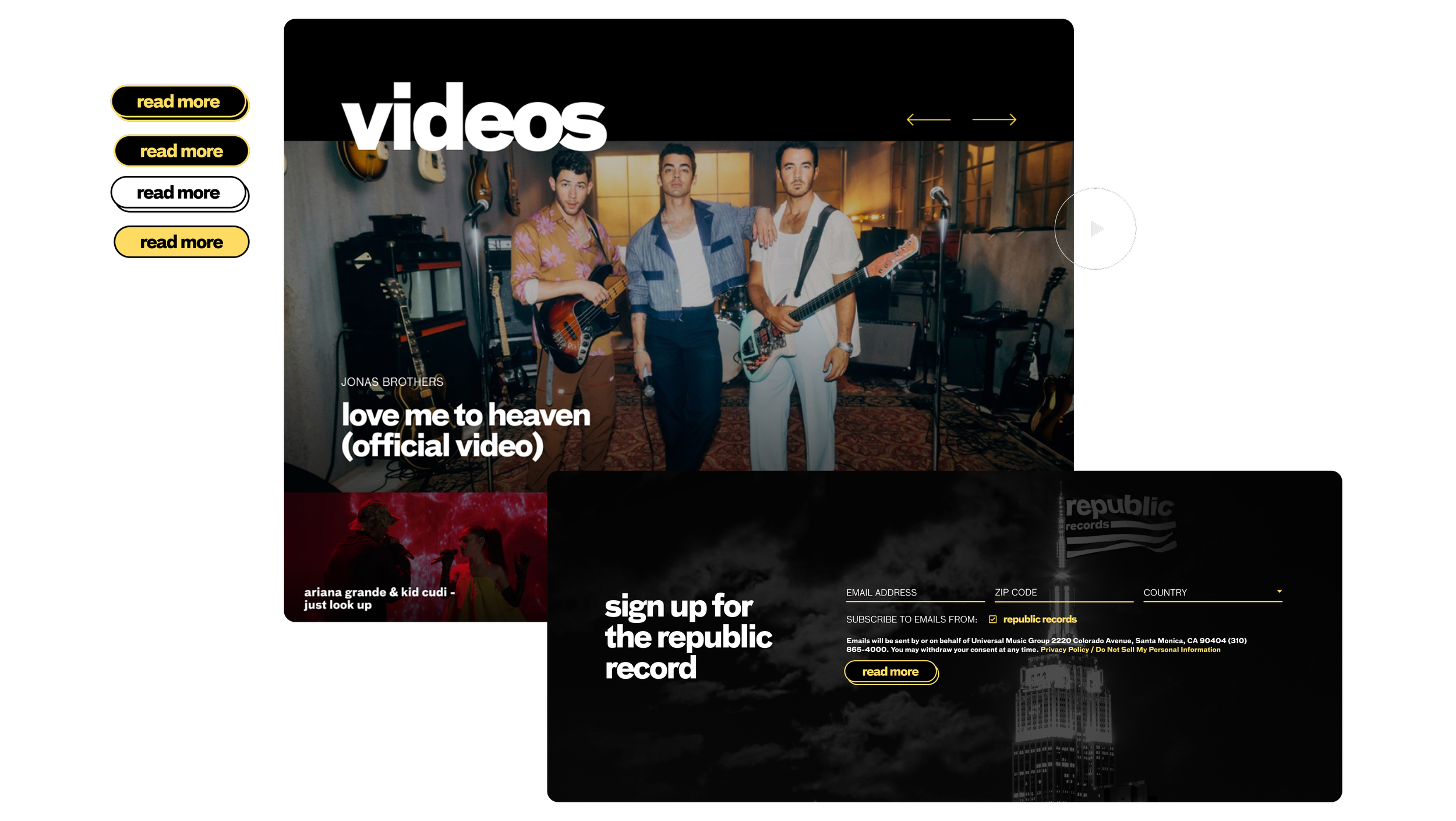
Small adjustments to typography hierarchy and spacing helped modernize the overall visual identity while still aligning with Republic’s existing brand.
Modern Typography
THE OUTCOME